Thursday, April 30, 2015

Retro Thursday - Mama Elephant

The card I'm sharing today features a Mama Elephant stamp set I've had for a while - Up and Away. While this set isn't retro or retired, it's still one I've held onto for a while, and thought I should make more use of. I'm also using a Mama Elephant die - Landscape Trio - to create the cute stitched clouds at the top of the card.

I started by stamping the cute bunny onto some marker paper. I masked him off, then stamped the umbrella. This gave the impression the umbrella is behind the bunny - which was exactly what I was going for. I colored everything in with Copics, then carefully fussy-cut around the image.

I found a fun rain pattern in a retired Basic Grey paper pad (Kelly Purkey's Mon Ami 6x6, for anyone interested), and I cut it out with the smaller rectangle in the Femme Frames die. I also cut a couple of pieces of white cardstock with the rectangle, and used the Landscape Trio border to turn them into clouds.

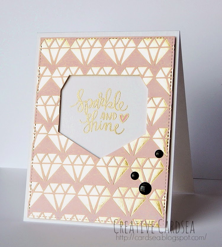
I stamped the sentiment onto a scrap of white cardstock.

After that, it was just a matter of layering everything together. I used a combination of adhesive and foam tape. Lastly, I scattered a few sparkly sequins around the card.

Thanks so much for reading!
~Elle~

Wednesday, April 29, 2015

You have my Heart


Today's card features another set from Birdie Brown, called You Have My Heart, as well as the Tag Builder 3 Blueprints die.

For this card, I wanted to do something simple. I did some Copic coloring, then die-cut the image and matted it with some light peach paper. I grabbed a couple of papers I had from old card kits and adhered them to the base. After adding the panel with foam tape, I added a few peachy enamel dots.

All in all, it was a pretty quick and easy card to make, but I really like how it turned out.

Thanks for reading!
~Elle~

P.S. I'm hitting a MEGA busy patch at work. I'm going to try to keep sharing cards, as I've got a little pile of finished ones sitting on my desk. But if I miss a day here and there, or if I'm not as cheery as usual, please forgive me!

Monday, April 27, 2015

OHC 86 - Butterfly


 Another Monday is upon us, and it's time for some color. This week, I'm sharing a color combo I have just a bit obsessed with lately -- peachy/coral, gray and mint. I'm finding myself really drawn to that combination, and (luckily) there are many new paper pads, cardstock and embellishments in these colors to choose from.

This card came about as I was working on an entry for my One Hundred Cards challenge (read about it here). I had pulled the theme "butterfly", and I decided to use the Butterflies stamp from Simon Says Stamp, as well as the coordinating dies.

I tried another new thing with this card - adding some washi tape. I picked up a pack of Sunset washi tape in my last order, and I was determined to use it. This helped shape up my card design as something with layered elements and shapes.

Thank you for reading!
~Elle~

Friday, April 24, 2015

Hello doll

It is Friday, and that means it's time for another illustration card! My last illustration card was made with a sketchy and loose style, so I decided to go in a completely different direction and go with a more solid illustration - something a bit closer to a stamped image.

Like last time, I went for a cute and simple sort of style, just having fun with some colors and patterns. Once I finished drawing her out, I thought she looked a bit like a doll. I'll probably practice drawing her out again - maybe she will go on all sorts of adventures!

I kept the rest of the card very simple. I used a piece of striped patterned paper along with grosgrain ribbon and some enamel dots for a fun factor. I added everything to a top-folding kraft card base, and there you have it.

Thanks so very much for reading!
~Elle~

Thursday, April 23, 2015

TGF- So Hip

Today's creation features another Super Secret Stamp Club stamp from The Greeting Farm. This month's stamp is called So Hip and it features a smartly dressed girl with a super fun hat.

For this card, I went in a somewhat different direction than usual and did a mishmash of patterns and textures. I was going for that lovely multi-layer style I see some of the talented crafters post. I don't know that I was super successful at it, but it was really fun to try.

I stamped the stamp in black and colored her with Copics. I wanted to use mostly neutral colors, with a touch of really bright for extra contrast - so tans and a bright minty/aqua teal. I carefully cut her out with scissors and set her aside.

For the rest of the card, I grabbed some scraps I had laying about and just layered them together. I die-cut the "hello" sentiment from a taupe-grey cardstock and put a bunch of little dots on it with a white gel pen. I used the same taupe-grey to stamp the paint splatters.

The sequins are a combination of sparkling white, gold and teal. They seemed to match the rest of the colors pretty well.

Thanks for reading!
~Elle~

Wednesday, April 22, 2015

OHC 67 - Vintage

Today, I'm sharing another card for my One Hundred Cards challenge (read more about it here). I'm using a super cute set from WPlus9 called Pick of the Litter. This set is smaller (and more affordable!), and it features sweet vintage-style images.

I started by stamping the girl and the kitten in brown ink onto some Copic marker paper. I used brown because it's softer and gives a slightly faded look. I colored my images as I usually do, using the B41 and B45 for the dress because they were a little less bright than my other blues. I trimmed the image down to a small size. I used the chisel tip of a YR82 (Mellow Peach) for the background. I simply covered the whole background, then switched to E84 to add in some subtle lines.

Then came the fun part! Making the image look older. I grabbed my trusty mini-blending tool and the Antique Linen distress ink, and went over any parts of the image that were very pale/white -- the girl's stockings, kitten, and a bit on her arms and face. I then blended in just a bit of that same antique linen ink into her dress - taking care with this one so it just looked aged, rather than turning her dress green.

I then switched to Vintage Photo and deepened the edges of the image.

I found some fun papers in my paper stash that weren't labeled vintage, but I think they still worked. The small flower print was a very popular motif in vintage, so a small pretty print from a card kit was perfect. And just to add a bit of contrast, I layered the image panel with some striped black and white paper.

As a last touch, I adhered a piece of flair from a Studio Calico's Darling Deer flair pack I found in my stash.

Thanks so much for reading!
~Elle~

Monday, April 20, 2015

Color Monday - Donuts


It's Monday, and it's another color day! Today's coloring is very, very simple, but it does showcase a couple of new things - adding depth and changing a stamp to add a bit more versatility.

The stamp I'm using today is Simon Says Stamp's I Love Donuts. This is a fun set that features a couple of donut sizes and some great (and funny!) sentiments. For this card, I decided to use the larger donut and stamp it out 3 times.

On the third donut, I made sure to mask off an area at the bottom right, because I wanted to make a small change to the stamp. I stamped all 3 onto some Copic paper in brown ink -- it reminded me of chocolate. I drew in a jagged/bite-mark line on the masked donut, and added a few crumbs.

The coloring itself was really simple. Glaze is very smooth and shiny, so it doesn't need any texture. This means you can get away with just using a flat color. I added a very thin line of darker color on the bottom right side of the glaze and on the bottom right of the donut hole. I added a simple circle highlight in the upper left with my gel pen. What this does is show that my light source is upper left, and that the glaze has some thickness to it. It's not paper-thin, and it sits raised on the donut - and it's glossy enough to have a highlight.

I used a simple light grey card base and arranged the 3 donuts there with foam tape. I stamped a sentiment in the same brown ink and added a few enamel dots for fun.

Thanks for reading!
~Elle~

Saturday, April 18, 2015

Hello Mae


Today's card features Some Odd Girl's Flirty Mae stamp set and a cute die from WPlus9 - Hey Hi Hello die. I tried to go for a slightly layered look and use some sequins and die-cut stars I found in my stash as a decoration.

One of the things I really love about this stamp is how much personality is conveyed in just a simple pose. You can easily make Mae look shy with a bit of blush or you could make her look flirty and coy with a bit more make-up. She almost has a story written about her, and that's something I find incredibly inspiring in stamps.

I went with a fun and airy sort of look for the rest of the card, giving it a more playful look. The patterned paper I used was from my scraps stash - great use of those materials that I might otherwise overlook.

Thanks for reading!
~Elle~

Thursday, April 16, 2015

OHC 75 - Music


A short while ago, I was one of the very lucky winners of the Simon Says Stamp Work it Wednesday challenge. (Super, super exciting!) After I picked my jaw off the floor, I got in touch with the wonderful staff and they sent me a surprise package.

I didn't know what was going to be in the package, so opening it was quite a thrill. My package was one of the older card kits - November 2012 kit to be exact. Cue in the excited "squee" and a couple of jumps from me.

I didn't start making cards until October 2013 (yes, you can see some of my very early attempts on the blog even!), and didn't start my subscription until December 2013. So, there's quite a few kits that I missed out on -- much to my disappointment. So, receiving this older kit was a fantastic surprise! The hoarder/completion-ist in me cheered for joy, and so did my creative self as looking through the kit contents gave me a great idea for a card.

I was inspired by the paper in this kit, which has a lovely layered look. I decided to go with that idea and add layers of my own. I also pulled out a stencil and my texture paste -- something I've been meaning to do on a card for ages, now. I layered the heart I stamped from the kit stamp, a sentiment and button that came with the kit. I added a tiny Tim Holtz paperclip for a little extra interest.

Lastly, I added a bit of gold strong to bring in some sparkle and shine. I adhered everything together onto a note-card. A few different-sized enamel dots finished the card.

Thank you so much for reading!
~Elle~

Wednesday, April 15, 2015

ME - Bear Hugs


I had something else planned to share today, but it's just been one of those days where time got away from me. I've been hard at work all day, feeling pretty tired at the moment- and I still feel like I accomplished so very little! So, instead, I'm sharing a very simple little card I created with Mama Elephant's Bear Hugs set.

Bear Hugs was one of those sets that I saw a sneak peek for and immediately fell in love. It's got really lovely sentiments and sweet bear images that are simple to color. And that's exactly what I did for this card. I stamped out the bears onto some Copic Marker paper and colored them in. Then I fussy-cut the image and set it aside.

The front panel was created by layering a couple of pieces of patterned paper. They're actually scraps from another card, but their size worked out just perfectly. I adhered everything together, added a small shadow under the bears and added it to a note-card.

Lastly, I stamped a sentiment in black ink.

Thanks for reading!
~Elle~

Tuesday, April 14, 2015

OHC 77 - Crystal


 Today's card is another entry in my One Hundred Cards challenge (you can read about the challenge here). When I pulled out the theme "crystal", I admit to feeling a little stumped about what I was going to create. Do I go with something sparkly? See-through? Glass-like? In the end, I decided to go with a more literal interpretation and include a patterned paper that features crystals or gems.

First, I really have to apologize for the image. It's a very simple card, but it was very difficult to photograph! The gold foil on the patterned paper and gold embossing on the sentiment are very, very bright, and it's tough to get a contrast that makes the colors stay true while still keeping things visible...

I die-cut the patterned paper into a rectangle, then used a ruler and my craft knife to cut a shape out of the middle. The sentiment is from Simon Says Stamp's Sparkle and Shine stamp set, which I received as a part of a card kit. I love the scripty font, and I thought it went perfectly with the card. I embossed it, colored in the card and adhered the paper on foam tape.

Then I added 3 enamel dots, and this card was complete.

Thanks for reading!
~Elle~

Monday, April 13, 2015

Color Monday -- SSC Rose


It's Monday, and that means it's time for another color creation! I'm not veering too var from my usual style this week - a cute stamp, Copics and some pretty patterned paper - but I did go for an unusual (and fun!) hair color.

The stamp I'm using is SSC Rose - a stamp I received as a part of The Greeting Farm's Secret Stamp Club. I've had Rose for some time now, but I just hadn't found the right time to color her in. Being on a crafty inspired kick got me rolling, though, so I stamped her out and got to work.

For her colors, I was inspired by her name - so, I went with a bubbly pink with some darker purplish undertones. I used several colors on her hair, including both R and RV families. I did a lot of layering to build up the depth, while still sticking with the lighter-colored markers. Her outfit was really simple. I kept the same pinks and added dark (black) with BV25 and BV29.

Since the coloring and the adorable skull made her look a bit Gothic, I went with my Gothic-inspired patterned paper. A few enamel dots later and the card was complete. :)

Thanks so much for reading!
~Elle~

Sunday, April 12, 2015

Just Fur You


If you're not familiar with Torico, the designer behind Birdie Brown, she is an extremely talented illustrator and card-maker. I often find myself studying her cards closely, as she has a really lovely and warm style with her cards. It's always inspiring to browse through her blog. And it always makes me want to pull out my Birdie Brown stamps to create something cute and fun.

So... Today's card uses Birdie Brown's I Knead You stamp set. I've already used this set once here, but I wanted to play with it again and make use of one of my currently favorite color combinations - peach and gray.

I pulled a few of my stitched rectangle dies to create layered panels. I did my own mini-pattern on the center panel by repeatedly stamping the mouse toy at an angle. For this and the sentiment, I used matching ink and cardstock, creating a tone-on-tone look.

I colored the kittens with Copics, going for brighter colors so they could stand out a bit better. I love the sleeping kitten on the right. He's chocolate-colored and reminds me of Choco, a cat that one of my friends had. It was an absolutely gorgeous long-haired cat with beautiful eyes. He was also really mean and liked to bite peoples' toes. XD

I kept this card super clean&simple, and only added 3 enamel dots in the center panel corner.

Thanks for reading!
~Elle~

Saturday, April 11, 2015

Sympathy Lilies


My mom visited recently and took with her the majority of the cards I've created over the past year - some to gift to friends, others to use herself. On one hand, this was wonderful! My cards will find a happy home somewhere and really brighten someone's day. On the other hand, it's left me with an empty stash that really needs to be replenished.

When it comes to sympathy cards, my go-to idea is simple and elegant flowers with a simple sentiment. For this card, I chose Taylored Expressions' Calla Lily Bouquet stamp. It's a lovely and large vase of flowers, and it has sentiments that also make it perfect for Easter, Mothers' Day or just "thinking of you".

I decided to go with watercolors this time, and wanted to soften the image contrast a bit, so I stamped them in brown. I used distress markers to water-color the image. There wasn't anything exceptional about my coloring here, I just did a simple wash of color without much shading and let the colors pool in around the darkest parts of the stamp.

When the watercolor piece was dry, I stamped the sentiment and trimmed it down. I wanted to do a subtle frame around it, so I used a piece of white cardstock to mat the front panel. I then adhered it to a raspberry Avery Elle notecard.

The notecard is a pretty bright color, so one might hesitate to use it for a somber occasion. But I think it works here because it contrasts with the front panel and makes the lilies stand out a little better. Another color I considered was a light blue - which would have echoed in the vase color. I preferred how the pink looked, though, and that's what I ultimately chose.

For this card, I hope I won't have a chance to use it for a very long time. :)

Thanks for reading!
~Elle~

Friday, April 10, 2015

Illustration Friday -- Rain, Rain...


It's Friday, and that means it's time for an illustrated card! This week, I wanted to go really simple and sketchy, so I drew in a cute girl with a raincoat and a little snail.

The inspiration for this card came from the patterned paper - Echo Park's Sunny Days Ahead 6x6. This cute and bright paper pad had a paper with rain boots, and I just loved how it looked. So, I decided to draw a simple rainy scene.

I lightly drew the girl, the closed flower and the snail. I used a pencil, then I went over and colored with my Copics. It went alright for the most part, but there were a couple of spots where the Copics smudged the pencil -- mainly around the girl's eye. Next time, I'll go even lighter with the Copics and not color in any parts (like I did with the eye).

Once all the coloring was done, I grabbed a Sakura Micron pen (I used the thinnest one) and went over the outlines. I kept the outlines very loose and imprecise because I love the sketchy look. Once that was done, I penned in the teeny sentiment in the upper corner, and drew a border.

Originally, the panel was just white all the way through, but I didn't like how it faded into the patterned paper, so I colored in a yellow border.

The card is a 4¼x 4¼" in size. I simply adhered the 4x4" piece of patterned paper to the card, then added the illustration panel with foam tape.

Thanks for reading!
~Elle~

Thursday, April 9, 2015

Sunset (Some Odd Girl)


I was in the mood to color yesterday, but to color something different and unique. See, I'd come across this pretty palette picture of a sunset:
And I just loved the color combination. I even found a patterned paper that had similar tones.

So, I stamped out Some Odd Girl's Miss You Mae and grabbed my Copics. I could have colored her in lots of different ways - a sunset dress, or sunset ruffles. But I decided to be bold and give her sunset hair.

I just grabbed markers in the similar colors as my inspiration photo and played around - minimal blending and just layering color here and there where it looked good. After her hair was done, I colored in her skin and dress, keeping them relatively simple. I added some white polkadots to the black ruffles for fun, and carefully cut her out.

I kept the rest of the card simple, adding a sentiment from Flirty Mae and scattering some Baby Mix sequins around the page. I matted everything onto some light blue cardstock, and the card was done.

Thanks for reading!
~Elle~

Wednesday, April 8, 2015

Tribal Thanks


I often find myself really inspired by paper, especially when it's a paper that's unusual or seems challenging to use. The paper in this card is from the Basic Grey Grand Bazaar 6x6, and I got it in my SSS October 2014 card kit.

At first glance, this paper seems a little intimidating to use. It's strongly colored, geometric and simple. Yet those properties also make it perfect for a masculine card - and that's where my creative gears went into overdrive, and I just knew I had to use it.

The colors and patterns looked somewhat tribal to me, so I grabbed Waffle Flower's Tribal Thanks stamp set. I got this set a little while ago because I just loved the way the silhouettes were drawn, but I hadn't found the right card to use them on.

Cutting the patterned paper at an angle gave me a place to put the main image and sentiment. I pulled the colors from the paper to create the mat for the bear and sentiment, and set them against a more creamy/beige background. Since the front panel had a lot of contrast, I used a black note-card as my card base.

As this is a masculine card and the pattern is busy, I chose not to add any embellishments or extras.

Thanks for reading!
~Elle~


Monday, April 6, 2015

Monster Hey

One of the really awesome things about having an organized crafty space is rediscovering supplies and feeling inspired to play with them again. As I was organizing my Simon Says Stamp kits, I set aside a few of the supplies that looked particularly fun and decided to make use of them.

This card uses the kit from May 2014 and the All Boy stamp set. One of the things I loved about this kit was the fun papers. They're quirky and masculine. The combination of muted greens with bright red is particularly eye-catching, and the patterns made for a very quick backgrounds that pops.

I just layered a few paper pieces together, stamped the sentiment and a few dots, and voila! No fuss, no pretty embellishment. Just a boy card. :D

Thanks for reading,
~Elle~

Sunday, April 5, 2015

Somebunny


Happy Easter, everyone! I hope you all have a lovely Sunday. :)

Today's card features the Somebunny stamp set by Birdie Brown. I love the sweet spring-time images in this set, as well as the adorable (and versatile!) sentiments. I think they make for lovely card pieces or maybe even a child storybook.

I went with a pastel color them for this card and made use of the yellow dotted vellum I've been hoarding for a few months now. It's from Doodlebug and I think I got a sheet or two in every color. It's a really great way to add some extra color while adding an interesting texture, too.

A few decorative dies gave me the perfect panels, and some Pretty Pink Posh sequins finished the card off!

Thanks for reading,
~Elle~

Saturday, April 4, 2015

Birthday Balloons


Simon Says Stamp's Wednesday Challenge is celebrating their 6th anniversary, and they're having a special celebration challenge. The theme for the challenge is Birthday, and I took this as the perfect opportunity to create a super cute card.


I've been wanting to play with the super cute elephant from WPlus9's Unforgettable set for ages now - ever since I got it, in fact. But I couldn't quite decide on how to use it. Once I grabbed Simon Say Stamp's Birthday Balloons stamp, it just clicked! The scripty "happy birthday" reminded me of balloon strings, and that went just perfectly with the elephant holding a bunch of balloons.

I used my Copics to color in the balloons and the elephant. I went for bright colors because birthdays are such a happy occasion. A couple die-cuts later, I had a card! As a last touch, I added some Crystal Reflections sequins - the colors matched up the balloons pretty well and it added just enough sparkle.

Supplies:
WPlus9 - Unforgettable stamp
Simon Says Stamp - Birthday Balloons stamp
Simon Says Stamp - Heavyweight cardstock in Mint
Simon Says Stamp - Crystal Reflections sequins
Avery Elle - Everyday Collection 6x6 
My Favorite Things - Hybrid Ink in Black Licorice
Copics

Friday, April 3, 2015

Is it Tea?


Avery Elle's Tea Time stamp set was one of the sets I was the most excited about when they previewed it a few months ago. I loved the cute cups with their delicate handles and lots of decorations that could be added. And then there's the sentiments... That sentiment on the card right there? I would have bought the stamp set for that sentiment alone. It's delicate and sweet and chuckle-inducing at the same time.

I went with a lot of neutral colors for this card, with just a pop of color (yep, you guessed it, I went with corral). I cut into my Avery Elle patterned paper (Zen and Neutral), and used a note-card for my card base. The rest of it was just fun die-cutting and layering.

I kept the card very simple, adding just a few enamel dots as embellishment. I really like that, as I think it lets the simple teacup take center stage.

Lastly, can I mention the sentiment again? 'Cause it's still making me giggle.

Thanks for reading!
~Elle~

Thursday, April 2, 2015

OHC - 18 - Purple


Today's card is another card in the One Hundred Cards challenge (read more about the challenge here). When I pulled the theme "Purple", I knew I wanted to make something soft and airy, while at the same time keeping it from becoming too monotone.

I used WPus9's Fanciful Feathers, which is a lovely feather set you might be familiar with from this card. For the feathers, I used two of WPlus9 dye inks - Cockleshell and Bloomsberry. I also used a sugarplum note-card from Avery Elle -- these note-cards are quickly becoming my favorite go-to for card bases.

I paired this card with  piece of warm gray polkadot paper. I chose to go with a warm gray background for two reasons. The first is because it's a great neutral that really makes the soft purples of the feathers pop. And the second is because I brought in some gold embossing to one of the feathers, and the warmth of the gray really tied in. I blended in some purple distress ink around the edges to add softness.

And that's pretty much it for this card. I kept it super simple, but the distressed edges and gold embossing add a little something special.

Thanks for reading!
~Elle~

Wednesday, April 1, 2015

Happy Meowday


Since it's April first, I thought it would be a good idea to share a funny card today. So, I'm sharing a card created with Neat and Tangled's set Meowwwww. This set was created by May Sukyong Parks, and it has some of the most hilarious and quirky cats ever! I had to buy it as soon as it was available for purchase, and I've been itching to use it ever since.

My card is fairly simple and straightforward. I colored in the stamps, added a bit of patterned paper and made my own wonky brick background with Copics. Then I adhered everything together and added some detail with a white gel pen.

Now, this card is a bit unique because I did something slightly different for my coloring. If you're like me, you've probably used your Copics on Bazzill's Marshmallow cardstock and found out that it bleeds terribly. Normally, this would man that you should just avoid that particular cardstock, but I decided to experiment. And I loved the result!

I kept my coloring loose and used a bit of colorless blender on the cat. I think the end result is this watercolor-like look where the coloring seems runny and undefined. This is great news for further experimenting with Copic-created Watercolor I talked about in this card (check out my initial inspiration in that link, which is one of Sandy Allnock's videos).

The coloring itself was a bit different. I had to stop way before the image edges, as the color would spread out. If you look closely, I've still got some bits where the background from the bricks kind of bled into the kitty, but it's (hopefully) not too noticeable.

Thanks for looking!
~Elle~