Sunday, August 31, 2014

Tiddly Inks: Adventure

Today's card features a lovely stamp by Tiddly Inks called Ellie Says Bye. I loved the air balloon so much that I just had to color it in. And, I gave it my own little spin by adding a few details. I wanted the balloon to look home-made, so I chose fun colors and patterns.

I started by stamping the balloon and Ellie onto some Copic marker paper, using MFT's Chocolate Brown hybrid ink. I wanted a softer, story-book like look and the brown ink was perfect. After cleaning up my stamp, I colored the image in with my Copics. I started with the basket and Ellie, then moved onto the balloon itself.

I saved a little spot for a patchwork piece, and colored the rest in simply. Then, I used my Copic drawing pen in Sepia to add some stitching lines around each square. I then added some patterns using a white gel pen.

After the image was dry, I carefully cut around it with scissors, leaving a small white border. I stamped a sentiment from the stamp set onto some white cardstock with the same chocolate brown ink. I cut it down to size and cut out a flag shape on one end.

The rest of the card came together very quickly. I created a standard A2 card base from white cardstock. Then I looked through my patterned papers and found the perfect one in Chickaniddy's Date Night 6x6 paper pad. I trimmed it to measure 4 by 5 1/4" and adhered it straight to the card.

I adhered the balloon and the sentiment to the card using thin foam squares. As a last touch, I added a couple of pink enamel dots to the sentiment panel.

Supplies:
Tiddly Inks Ellie Says Bye stamp set
MFT Hybrid Ink in Chocolate Brown
Copic Mini Marker Pad 70lbs
Copic Drawing pen in Sepia
Copics: Basket (E33, E37, E29, E50, E53, E33, YG23, YG25, YG17), Ellie (E00, E11, E13, E35, E57, E59, R11, RV42, R32, C4, C6, R20,0), Balloon (Y21, Y35, Y38, B00, B91, B95, YG13, YG23, YG67, R11, RV42, RV55)
Sakura Gellyroll White Gel Pen
Neenah Solar White cardstock in 110#lbs
Chickaniddy Date Night 6x6 patterned paper pad
Freckled Fawn Pinks enamel dots

Saturday, August 30, 2014

SOG- Ghostly Violin


Today is your lucky day, because I have 2 digi cards to share!

You might have already seen my earlier version of Some Odd Girl's Violin Gwen, so you probably know that I just adore it. Since I had printed her out twice last time, I decided to color her in again.

Originally, I was going to go for a black-and-white Noir feel - something glamorous and pale. But as I was coloring her, it struck me that she looked a bit ghostly. So, of course, I had to go all out and make her into a proper undead.

After I finished coloring Gwen in, her pupils and smile looked a bit out of place. So, I used my white gel pen to "erase" a few of the lines. Now she has a blank stare with no pupil, and a much more sad face.

I carefully cut around the stamp, leaving a small white border and set it aside for the rest of the card.

I made a base by cutting a scoring a piece of navy cardstock in half to create a standard A2 card (4 1/4 by 5 1/2"). Then I grabbed a piece of patterned paper from the Gorjuss paper pad and cut it to measure 4 by 5 1/4". I adhered it to the base with my standard dot adhesive.

I adhered Gwen to the card with foam squares. For the sentiment, I found the perfect sticker in the Echo Park mini music collection kit. As a last touch, I added a few black, gray and white enamel dots.

Supplies:
Some Odd Girl Violin Gwen digital stamp
Copic X-Press It Blending Cardstock
My Favorite Things Heavy Cardstock in Nightshift Blue
Simply Gorjuss 6x6 patterned paper pad
My Mind's Eye Essentials Blacks&Grays enamel dots
Scrapbook Adhesives 3D Foam Squares
Echo Park Mini Music Collection Kit
Copics: C2, C4, C6, C8, W2, W4, W6, R20, BV11, BV13, E33, E17, BV25, BV29, R08, R59, R89
Sakura Gellyroll White Gel Pen

Marie Antoinette


It's Saturday, and that means another digi day! Today's card features the gorgeous Marie Antoinette stamp from AuroraWings Etsy shop.

I started by printing out the stamp onto some Copic X-Press it paper. The stamp's site had a glimpse at a possible way to color Marie, so I used it as an example and chose soft pinks, light blonde hair and some blues for contrast.

As always, I started with the skin, then moved onto the clothing and hair. Since there was so much detail in her outfit and hair, I kept the coloring fairly simple - switching between different colors and using very simple shading.

After she was colored in, I carefully cut around her with scissors, leaving a small white border.

As the stamp was very elaborate, I chose to keep the rest of the card extremely simple. I cut a piece of pink cardstock to a standard A2 size (4 1/4 by 5 1/2"). While I had my trimmer out, I also cut a piece of patterned paper to 4 by 5 1/4". I adhered the paper to the card with my standard adhesive, then added Marie with foam squares.

I added a couple of flowers to the upper left corner. Lastly, I scattered a whole bunch of pearls around the card.

Supplies:
Marie-Antoinette digital stamp by AuroraWings
Copic X-Press It Blending Cardstock
My Favorite Things Heavyweight cardstock in Pink Lemonade
Glitz Designs Hello Friend 6x6 paper pad
Tombow Dot Adhesive Runner (pink)
Melissa Frances White Pearls
Prima Flowers flowers
Sakura Gellyroll White Gel Pen
Copics: Skin (E00, E11, E13, E15, R20, 0), Hair (E81, E42, E53, E33), Dress (B000, B00, BG01, B02, B41, B45, RV11, R85, R29, R59, 0), Cupcakes (Y13, YR14, B00, B41), Other Decorations (BG11, R22, R35, BV11, BV13, BV25, Y11, G24, YG63)

Friday, August 29, 2014

MFT- Spooky

I mentioned in my last post that I've been trying to put some effort into having some simpler designs that I could use to create card sets. I'm very much make-it-up-as-I-go when it comes to cardmaking, which is both wonderful and frustrating. It's wonderful because I end up with a design that's completely unique and inspired. It's frustrating because I can never replicate it entirely or turn it into a set. So, I continue with my quest to find some classic and simple designs I can use for card sets.

My friend Kylie suggested a while ago that I should take part in some of the weekly MFT designer sketch challenges, and I thought it would be the perfect way to explore the card set idea and grab a few go-to designs.

This week, the sketch was a pretty simple one:
As I was going through my MFT stamps, I decided to use the newest Birdie Brown - Witch Way Is The Candy stamp set - and make a Halloween card. I know, Halloween is some time away, but it never hurts to be prepared!

I started by creating a background panel out of MFT's Limeade cardstock by cutting a rectangle panel to measure 3 3/4 by 5". I then took out MFT's Striped Background cling stamp and inked it with Limeade hybrid ink for a tone-on-tone look.

Witch Way Is The Candy has a few adorable critters, but I finally settled on the cat. After stamping her onto some Copic marker paper with Black Licorice hybrid ink, I colored her in with Copics. I chose to make her a black cat, and colored the bow in orange. Although the set has a coordinating die, I didn't have it - so I cut around the cat with my scissors, leaving a small white border.

I grabbed my Bigshot and MFT's Stitched Circle STAX dies to cut out two circles - one in black, one in orange. I layered them together with my standard dot adhesive, and added the cat with foam squares.

I cut out two black strips and one wider orange strip with my paper trimmer. I adhered them to the striped panel at an angle with my standard dot adhesive, then added the circles and the cat in the bottom left corner. While I had my paper trimmer out, I cut and scored half of the black cardstock sheet to create a standard top-folding A2 card (4 1/4 by 5 1/2").

I wanted to add another layer between the card base and the striped panel. I tried a few color combinations, but finally decided on another Limeade panel - this time measuring 4" by 5 1/4". I used some foam squares to adhere the two panels together, then adhered it to the card front.

Lastly came the sentiment. I really like how clean and simple the rest of the card looked, so I decided to use some white sticker letters from Basic Grey to spell out the word "spooky". I made sure the letters were not set in a straight line for a bit of a whimsical touch.

Supplies:
My Favorite Things Birdie Brown: Witch Way Is The Candy stamp set
My Favorite Things BG Striped Background cling stamp set
My Favorite Things Heavy Cardstock in Limeade
My Favorite Things Hybrid Ink in Limeade and Black Licorice
My Favorite Things Stitched Circle STAX dies
Copic Mini Marker Pad 70lbs
Avery Elle New Moon cardstock
Simon Says Stamp Orange Peel cardstock
Basic Grey White sticker letters
Tombow Dot Adhesive Runner (pink)
Scrapbook Adhesives 3D Foam Squares
Copics (R22, Y15, BV13, BV25, BV29, YR14, YR68)

Thursday, August 28, 2014

Fall Tree Thanks

Simon Says Stamp has a new Work It Wednesday post up, and I definitely wanted to play along! The challenge this month was stamping - which I feel like I should do more of. I get tied up in coloring (Copic or watercolor) so often! It's incredibly fun to color, sure, but it's a long process and it usually means that I can't make more than one card. Since I'd like to eventually give card sets away as a gift, I need to have a few designs that are easier to make multiples of.


This card was inspired by a gorgeous winter watercolor painting I saw recently. The artist had used the watercolor drip technique and lots of color - which produced a really incredible result. I liked the randomness of color and how it looked like a tree even if none of the leaves were defined. So, with a nod to the talented artist, I looked through my many stamps and found something I thought would work.

I started by stamping the tree trunk and the sentiment from Simon Says Stamp's Giving Thanks stamp set, using dark brown ink.

I then grabbed WPlus9's Ink Splats stamp set, and used one of the large ink splotches to create the base foliage. I inked half in yellow and half in orange. I then switched over to the smaller ink splatter and stamped them randomly over the tree for extra detail.

I cut the panel to measure 3 3/4 by 5". While I had my trimmer out, I also cut a piece of matching dark brown cardstock to measure 4 by 5 1/4", which created the perfect frame for the card. Lastly, I cut and scored half of a sheet of white cardstock into a standard A2 card.

I adhered the stamped panel to the dark brown panel with foam tape, then adhered both to the card with my standard adhesive.

Supplies:
Simon Says Stamp Giving Thanks stamp set
WPlus9 Ink Splats stamp set
Stampin' Up Classic Inkpad in Chocolate Chip, Daffodil Delight and Pumpkin Pie
Stampin' Up Cardstock in Chocolate Chip
Neenah Solar White Cardstock in 80#lbs (stamped panel) and 110#lbs (base)
3M Double-Sided Foam Tape
Tombow Dot Adhesive Runner (pink)

Wednesday, August 27, 2014

I like big books & I cannot lie!

When I saw the reveal for Simon Says Stamp's September card kit, I was super excited! I'm a huge bookworm, and I've got several family members who work or volunteer at local libraries, so I knew straight away I'd be making great use of the kit. And then when I saw that the stamp set was a very graphic and modular set... Be still my heart!

This month, the kit has a set of 4x8 October Afternoon library themed papers, a mini inkpad in Gathered Twigs (which I did not have, woo!), a matching library sticker sheet, wood enamel dots and the standard cardstock and fabulous new stamp set. If you were a subscriber, you also received a roll of Kelly Purkey washi tape - mine had a name and date washi.

The papers included in this month's kit were of a bit of a different size - 4 by 8". By cutting them in half, I got two 4x4" paper panels. So, I decided to go with a different size for my card base, and cut and scored the cardstock into a 4 1/4 by 4 1/4" square card base. While I had my trimmer out, I also cut a sheet of library paper in half (i.e. 4x4" square).

I adhered the patterned paper onto the card base. Since I had a spare rectangle of cardstock leftover from the card base, I used it to create a panel where I could layer more of the patterned paper. So, I cut a piece of chevron paper to measure 2 by 4" and the kraft cardstock to measure 2 1/4 by 4". I adhered the chevron paper to the cardstock and then adhered the entire panel onto the card base with foam squares.

I wanted to add a stamp panel to the card in form of a tag. But none of the tag dies I had were the right size. They were either too skinny or too long. So, I grabbed one of the tag dies in Lawn Fawn's Tag It die set and used it on a piece of cream cardstock that came with the kit. After I ran it through the Bigshot, I lined up the die-cut piece and moved it down - so when I ran it through the Bigshot again, it would make for a shorter tag.

I stamped a few colorful books at the bottom of the tag, then the sentiment above. Lastly, I stamped a little red apple to tie in with the patterned paper colors. After the stamping was done, I used my mini blending tool and Tea Dye distress ink to go around the tag edges.

I added some hemp cord at the top of the tag, then adhered the tag to the card with foam squares. Lastly, I added one tiny wood enamel dot at the top of the chevron panel.

Supplies:
Simon Says Stamp September 2014 Card Kit
Stampin' Up Classic Inkpads in Daffodil Delight, Tempting Turquoise and Soft Suede
Lawn Fawn Tag It dies
Ranger Mini blending tool
Distress Inkpad in Tea Dye
Hemptique Natural Hemp Cord (single)
Scrapbook Adhesives 3D Foam Squares
Tombow Dot Adhesive Runner (pink)
Fiskars Premium Cut Line Paper Trimmer - 12"
Martha Stewart Mini Scoring Board

Tuesday, August 26, 2014

SOG - Rani Congrats

I was in the mood to do something very bright and colorful, and this Rani digi stamp from Some Odd Girl just looked perfect! I had fun with bright colors and jewel tones. And, of course, I created a whole card around it.

I started by printing out Rani and coloring her in with my Copics. I used darker skin tones, and a mix of pink, blue and gold for her outfit. After she was completely colored in, I carefully cut her aside while I worked on the card background.

I cut and scored a piece of navy cardstock to create a standard A2 card (4 1/4 by 5 1/2"). I also cut a couple of panels: navy (2 1/2 by 4") and white (2 1/4 by 4") that I would use for the sentiment. I stamped the pink decorations and a blue congrats using Altenew's Hennah Elements stamp set.

I rummaged through my stash of papers and found this lovely paisley pattern. The bits of color matched up with the rest of my design, so I cut it into a 4 by 5 1/4" rectangle and adhered it to the card base. I then adhered the navy and white sentiment panel.

Lastly, I added Rani, using some foam squares to make her pop off the page a little. Since the card had plenty of color and detail, I chose not to add any other embellishments.

Supplies:
Some Odd Girl Rani digital stamp
Copic X-Press It Blending Card paper
Copics: Skin (E13, E15, E18, R43, 0), Hair (BV17, BV25, BV29, 100), Gold (Y21, Y38), Blue (B02, BG01, B37, BG07, B00), Pink (RV14, RV55, RV66)
My Favorite Things Heavyweight Cardstock in Nightshift Blue
Neenah Solar White Cardstock in 80#lbs
Altenew Hennah Elements stamp set
Stampin' Up Classic Inkpads in Strawberry Slush and Tempting Turquoise
Stampin' Up Foam Dimensionals

Monday, August 25, 2014

Blog Hop: Warm Wishes Coffee

This card is my second entry to Pretty Pink Posh's Cutting Edge blog hop.
For this card, I decided to use the Hot Concoctions set by Paper Smooches, as well as a few fun dies. I stamped the coffee cup twice onto some Copic marker paper, and colored them in with my Copics. I also stamped out a couple of hearts and colored them in as well. I carefully cut them out and set them aside while I worked on the rest of the card.

The first step was to make a watercolor background. I wanted it to look a bit like the paper was coffee-stained. So, I used the Brushed Corduroy distress marker to create a warm brown-toned wash on some watercolor paper. While it was still wet, I made some splatters with a brush, using Gathered Twigs distress marker for color. This created soft and diffused texture you see in the upper left of the panel. I wanted to make sure there were some detailed drops, as well. I waited for the background to dry, then I splattered some more drops of Gathered Twigs. Then I set it aside to dry completely.

It was time to have fun with dies! I started by grabbing My Favorite Things' Blueprints 13, Mama Elephant's Femme Frames and Pretty Pink Posh's newest Stitched Duo II dies. The awesome thing about all 3 of these dies is that they each make a stitched rectangle of a different size, and they nest together just perfectly!

I cut the biggest panel with Blueprints 13 out of brown cardstock. For the medium panel, I used Femme Frames and a piece of patterned paper. Lastly, I cut a panel from the watercolor background with the rectangle from the Stitched Duo II dies.

Before assembling the card, I adhered the two coffee cups and hearts with Tombow Mono-Multi glue. I also drew in a couple teeny hearts under the red heart. I stamped some curly steam as well as the sentiment in brown ink. Then, I put the card together. I used a combination of my standard dot adhesive and foam tape.

Once all the layers were ready, I adhered it to a white standard top-folding A2 card (4 1/4 by 5 1/2").

Supplies:
Paper Smooches Hot Concoctions
My Favorite Things Hybrid Ink in Black Licorice
My Favorite Things Blueprints 13 dies
Mama Elephant Femme Frames dies
Pretty Pink Posh Stitched Duo II dies
Stampin' Up Classic Inkpad in Baked Brown Sugar
Stampin' Up Cardstock in Baked Brown Sugar
Neenah Solar White 110#lbs Cardstock (base)
Stampin' Up Retro Fresh Designer Paper
Tim Holtz Distress Watercolor Paper
Copics (E81, E42, E35, E37, E29, G12, G24, YG63)
Distress Markers in Brushed Corduroy and Gathered Twigs
Tombow Mono-Multi Liquid glue
Tombow Dot Adhesive (pink)
3M Double-Sided Foam Tape (permanent)

Watercolor Ruby

Today's card was inspired by my friend Kylie. She recently posted two wonderful cards that use the Ruby stamp from Gorjuss. Since I recently got that stamp set, I figured I should play with it too! So, here's my card. :)

I started by stamping the stamp onto a piece of Tim Holtz distress watercolor paper. I taped it down with painters' tape so it wouldn't warp too much - and also because it leaves a lovely white border around the card.

I colored the image with my distress markers and water.  My method is to scribble the marker onto a flat plastic palette, then use a wet brush to pick up the color. I prefer this method over using an acrylic block because it keeps the mess contained, and gives me several compartments for the different colors. Plus, the white makes it easier to see some of the lighter/more subtle colors.

I started by coloring the skin. I used Tattered Rose to quickly color in the skin, and used Worn Lipstick for a bit of blush on her cheeks. After the skin was completely dry, I used some Vintage Photo to put a bit of shadow under her bangs.

For her dress and shoes, I first did a light wash of Evergreen Bough, then brought in some Peacock Feathers to deepen the shadows. While that was drying, I colored in her hair. I started with a wash of Squeezed Lemonade across the entire hair. I then brought in Wild Honey around where the shadows would hit and let it dry. Lastly, I used some Brushed Corduroy in just a few areas where the shadows would be the darkest.

I moved onto the kitten. I used a combination of Squeezed Lemonade and Spiced Marmalade to get a base coat. Once that was dry, I drew in the kitten's stripes with the Spiced Marmalade marker. I softened it a bit by brushing over it with a bit of water.

I finished up with her tights and the swing. After the girl was dry, I created the background by mixing several light washes of color - pinks, purples and blues. Lastly, I loaded the brush with color and flicked it over the picture for some spatters.

Once the entire panel was dry, I peeled off the painters' tape and trimmed the watercolor paper to measure 4 by 5 1/4". I created the card base from Simon Says Stamp's Blue Violet cardstock by cutting and scoring it in half for a standard A2 top-folding card. I adhered the watercolor panel to the card base using lots and lots of foam tape.

Supplies:
Gorjuss' Ruby stamp
Fiskars Compact Stamping Press
Tim Holtz Distress Watercolor Paper
Painters' Tape
Distress markers (Tattered Rose, Worn Lipstick, Vintage Photo, Evergreen Bough, Peacock Feathers, Squeezed Lemonade, Wild Honey, Brushed Corduroy, Spiced Marmalade, Gathered Twigs, Weathered Wood, Ripe Persimmon, Salty Ocean, Dusty Concord, Seedless Preserves, Tumbled Glass)
3M Scotch Double-Sided Foam Tape
Simon Says Stamp Heavyweight 100#lbs Cardstock in Blue Violet

Saturday, August 23, 2014

Violin Gwen

It's Saturday! This means it's time for another card with a digi stamp.

Today, I'm playing with the absolutely gorgeous Violin Gwen digi from Some Odd Girl. We got a sneak peek at the stamp from the Odd Girl DT on the facebook group just yesterday, and I had to buy her straight away.

I started by printing the stamp onto some Copic X-Press it cardstock. I cut the image down to a rectangle and colored her in with my Copics. It took  me quite a while to decide what kind of color I wanted to go with for the bottom of the dress, but I finally settled on blue. I also added a fun dotted background. I found this technique on Delphine's blog initially, though I didn't go about it in quite the same way. I used grays and a touch of pink for the dots.

After the coloring was done, I trimmed the image a bit, since it was almost too large to fit onto a card.

For the base, I cut and scored a piece of MFT's Grout Gray cardstock in half to create a top-folding A2 card. While I had my trimmer out, I also cut a piece of patterned paper for the card background. I used Echo Park's Melody of Life mini paper pack, which went just perfectly with the theme and the colors of the card.

I used my mini blending tool and Broken China inkpad to go around the edges of the patterned paper and the stamp panel. This made both panels stand out a little better, and tied in with Gwen's dress. I adhered both the patterned paper and the stamp panel to the card base with foam tape.

Lastly, I added a few flowers to the upper right part of the card. I scattered a few pearls around it, and voila!

Supplies:
Some Odd Girl Violin Gwen digital stamp
Copic X-Press It Cardstock
My Favorite Things Heavyweight Cardstock in Grout Gray
Echo Park Melody of Life 12x12 mini pack
Ranger Mini Round Ink Blending tool
Ranger Distress Inkpad in Broken China
3M Scotch Double-Sided Foam Tape
Prima Flowers Bloom collection (grey)
Prima Flowers Seashore collection (blue)
Copics: Skin (E00, E11, E13, E15, R20, R32, 0), Eyes (YG41, YG45), Violin (BV11, BV25, BV29, E33, E18, E29), Hair (Y21, E33, E25, E27, Y35), Dress (B00, BG01, B02, BG07, BG49, BV11, BV25, BV29), Background (C2, C4, RV11, 0)

Friday, August 22, 2014

Ahoy! (blog hop)

Since I'm a big fan of Pretty Pink Posh, I really wanted to take part in the fun new blog hop -- which is all about dies!

And, here's my card:
I started by creating my card base from Kraft cardstock - a standard A2 card base which measures 4 1/4 by 5 1/2".

I decided on a nautical card, so I grabbed Sweet Stamp Shop's Ahoy! stamp set and stamped the boat in black ink onto some Copic marker paper. I colored it in with my Copics and carefully cut around it, leaving a small white border. I stamped the sentiment onto a piece of white cardstock in navy ink, and also cut it out.

Then came the time to have fun with dies! I created a base panel from white cardstock, using Mama Elephant Femme Frames dies. I also cut a plain white circle using my Sizzix Circles framelits. I then grabbed a couple of papers from Carta Bella's Ahoy There! paper pad. I cut the red paper with a die from My Favorite Things' Blueprints 13, and a wave paper circle from the Sizzix circles framelits.

I adhered the base panel and the red piece straight to the card base. I also adhered the white circle and the wave circle with dot adhesive, then added it to the card with foam tape. I used foam tape to adhere the boat and the sentiment.

The last touch was a few Pretty Pink Posh sequins - in cobalt and aquamarine.

Supplies:
Sweet Stamp Shop Ahoy! stamp
My Favorite Things Hybrid Ink in Black Licorice
Stampin' Up Night of Navy classic inkpad
Neenah Desert Storm Environmental Cardstock in 100#lbs
Neenah Solar White Cardstock in 80#lbs
Copic Mini Marker Pad in 70#lbs
Copics (C4, C6, C8, E23, E25, E27, E29, R08, R46, B00, 0)
Carta Bella Ahoy There! 6x6 patterned paper
My Favorite Things Blueprints 13 dies
Mama Elephant Femme Frames dies
Sizzix Framelits Circles
Tombow Dot Adhesive (pink)
3M Scotch Foam Tape
Ranger Studio Multi-Medium glue
Pretty Pink Posh Sequins, cupped, 6mm in Cobalt and Aquamarine

For Teacher

Today, I've got a couple of cards to share!

There's something so exciting about a new school year - from shopping for supplies, to meeting new friends and getting to know your teacher. Speaking of teachers, we're getting brand new teachers this year, so I decided to create a few teacher cards.


I'm using two adorable school-themed images from Pollycraft's Brains and Sparky - both of which were bought from C.C. Design's website.

I started by stamping the images and coloring them in with my Copics. Since I knew I'd be using a fun school patterned paper as the background, I kept the stamped images very simple and only scribbled in a shadow under the feet. I cut the images to a rectangle that measures 3 1/2 by 2 1/2"and set them aside while I worked on the rest of the card.

For the base, I made a standard top-folding A2 card by cutting and scoring MFT's Brick Red cardstock ink half to measure 4 1/4 by 5 1/2". I also decided to mat the colored images and the sentiment in the same cardstock, so I cut a couple more panels.

I decided to use one of the lovely new Simon Says Stamp's teacher dies. I used it on a piece of Slate cardstock. Since the die is delicate and thin in some parts, I used a metal adapter to make sure it would cut out perfectly.

The patterned paper is from My Mind's Eye School Daze 6x6, and I trimmed it to measure 4 by 5 1/4".

Last step was to assemble the cards. I adhered the patterned paper to the base with my standard dot adhesive. I matted the stamped image onto the cardstock, and adhered it to the card with foam squares. I adhered the "teacher" diecut with spots of Tombow glue, then matted it to the brick cardstock and adhered to the card with foam squares.

And that's all there was to it!

Supplies:
Pollycraft Brains stamp (from C.C. Designs)
Pollycraft Sparky stamp (from C.C. Designs)
My Favorite Things Hybrid Ink in Black Licorice
My Favorite Things Heavyweight cardstock in Brick Red
Copic Marker Mini Paper 70#lbs
Simon Says Stamp Heavyweight Cardstock in Slate
Simon Says Stamp Teacher die
My Mind's Eye School Daze 6x6
Copics
Scrapbook Adhesives 3D foam squares
Tombow dot adhesive (pink)
Tombow Mono-Multi Liquid glue

Thursday, August 21, 2014

Mama Elephant - Cupcake (and some exciting news)

Okay, before I get to the card today, I've got a bit of news...

Ta-da! My cute kraft boat card was the challenge winner this week!!! Oh, I'm so excited! And amazed, and a bunch of other bubbly good feelings. And! I just read that Avery Elle's going to be releasing a bundle of new stamps and dies, not to mention a bunch of new inks (!) and a new patterned paper pack in early September. How awesome is that?!?

Okay, now that my super exciting morning news are done (and yes, I'm still bubbling with excitement), let's get on with the card.


 As you might already know from my previous posts, I'm a HUGE fan of Torico's work -- both as a card maker and a stamp designer for Birdie Brown. So, when I read that Torico was doing a special collaboration with Mama Elephant for two new stamp sets, I bought them right away. And, of course, I had to make a card as soon as I got the set.

I started by stamping several cute elements from both Carnival Cupcakes and Carnival Toppers onto Copic marker paper, using MFT's hybrid ink. I colored them in with my Copics and added some polka dots and accents with a white gel pen. The two sets do have matching dies, but I didn't pick them up yet. So, I used my trusty scissors.

I created the card base from MFT's Primitive Cream cardstock - by cutting and scoring it in half to create a standard A2 card (4 1/4 by 5 1/2").

I wanted to have a sweet kind of look with a touch of country, so I chose to use My Mind's Eye Ashbury Heights paper. I cut a base layer from black polkadot paper, and another layer from the cream paper using Mama Elephant's Femme Frames. I then cut a smaller frame from the plaid patterned paper with Mama Elephant's Type It die. Lastly, I die-cut a stitched circle out of white cardstock that would be a background for the cupcake and bear.

I adhered the two largest panels with my standard dot adhesive, then added the plaid panel wit foam dimensionals. For the center circle, I used a combination of dot adhesive and foam dimensionals. It looked a bit like the cupcake and bear were floating, so I quickly drew in a sketchy shadow for them.

I adhered the center circle to the card front, and the card was done! :)

Supplies:
Mama Elephant Carnival Cupcakes stamp set
Mama Elephant Carnival Toppers stamp set
My Favorite Things Hybrid Ink in Black Licorice
Mama Elephant Femme Frames dies
Mama Elephant Type It dies
My Favorite Things Stitched Circle STAX dies
My Favorite Things Heavyweight Cardstock in Primitive Cream
Copic Mini Marker Pad 70#lbs.
Neenah Solar White 80#lbs cardstock
Copics: Bear (R81, RV55, RV66, B000, R22, R35), Cupcake (E23, E29, E47, B000, B00, B41, B45, 0), Rose (R05, R46, R59, YG25, G46), Bow (V12, V06, V17)
Copic Sketch pen in Sepia
Sakura Gellyroll White Gel Pen

Tuesday, August 19, 2014

Geometric Trees

Last night, I came across the Addicted to CAS challenge blog, and saw that they have a really interesting challenge going on at the moment.
The moment I saw the code word, I just knew I had the perfect stamp for it. So, I decided to make a CAS card and enter the challenge!

I started by creating my base out of MFT's Sweet Tooth cardstock by cutting and scoring it in half for a standard A2 card. I then cut a panel of white cardstock to measure 4 by 5 1/4".

I used Sweet Stamp Shop's retired set Fall Gratitude to stamp out some fabulous geometric trees and corresponding trunks. I drew a line in pencil to make sure all the trunks were even, then erased it after the ink was dry.

For the sentiment, I used Simon Says Stamp's Giving Thanks stamp set. I also stamped a little orange bird for an extra punch of color.

Lastly, I adhered the panel to the card base with foam tape.

Supplies:
Sweet Stamp Shop Fall Gratitude (retired)
Simon Says Stamp Giving Thanks
Stampin' Up inkpads in Calypso Coral, Baked Brown Sugar, Pumpkin Pie and Chocolate Chip
My Favorite Things Heavyweight Cardstock in Sweet Tooth
Neenah Solar White 80#lbs cardstock
3M Scotch Double-sided Foam Tape

Monday, August 18, 2014

Copic 101 - Hair

A short while ago, my friend Kylie suggested that I write a tutorial about how to shade hair with Copic markers. I've been planning on starting a chat about Copics, but I keep getting bogged down about what to talk about. So, hair seemed like a pretty good place to start.

Although I don't consider myself a pro (I'm not a certified Copic instructor, after all), I did sit down and jot a few tips that might be helpful. And I figured it wouldn't hurt to share.

Let's start with a simple experiment. Take a thin sheet of paper (printer paper works awesome). Hold it up to the light and see how white it is all over. Then, pinch it at the top and the bottom and bend it into an S shape. Now, if you look closely, you'll notice that the paper is no longer white everywhere. There are gray shadows where the paper is curved in and where the light is blocked.

It's probably pretty easy to see how this applies to wavy hair - that basic S shape is your guide that shows you which areas are darker and which are lighter. But what about straight hair? Well, the same principle still applies! Even the straightest of hair is still on a head - which has a round shape. So, you will have portions that curve in (like near the roots) and out (like the temples, where the head is at its widest).

Ok, let's get into some of the essentials.

Choosing your colors
Colors can be really intimidating - especially with Copics, which happen to have a million shades. But it's not scary, I promise!

You can ease into choosing your color palette by looking at what some of the other crafters are using. Jot down the color combinations when you see some that you like. And you'll find that there are many! Just like saying someone has "brown" hair could mean hundreds of different shades, there are just as many combinations of Copics you could use for hair.

There's also stamp packaging. If there's no colored image on the stamp packaging, check out the company's website. They will often have examples of how the image could be colored - which is a fantastic starting point.

Once you've figured out your go-to combo, experiment! Switch out a color and see how it changes the result. And don't just stick to one family. Try mixing in some BV in your reds rotation, or even a dark red with greens. Not all combinations will work, but some of them will have a surprising amount of depth.

Flicking and texture
If you've ever watched a Copic coloring video, you've probably heard something called "flicking". This refers to a specific motion that gives you a line that's a bit like a tear shape - rounded on the top and tapering at the bottom.

The best way to explain it is to think of it as if you're quickly drawing a check-mark - using your wrist rather than the whole arm. The important part is right at the end - when you're using less pressure and lifting the pen off the paper. This is what you want to practice with Copics. So, you start with a a bit of pressure, lifting the marker off the paper as you move your wrist. It's a quick movement. You'll know you've done it right when the line looks a bit like a teardrop.

Why is Flicking important? Well, it's one of the easiest ways to show texture in hair. Stamped images are usually very small, and Copic markers are not 0.1mm thin. This means that you can't keep drawing lines to show individual hair, so you have to show texture in a slightly different way.

Try practicing holding the pen at different angles (more vertical = generally thinner line) and different amounts of pressure. Also try various stroke lengths - see what a difference it makes when you lift the marker right away, versus making the line longer and lifting it later.

Blending
The biggest tip I can give you about blending hair is to not. Yes, that's right. You don't need to blend hair. Leaving hair un-blended gives you that contrast between different sections and makes the hair look like it has strands.

But what if it just looks off? Well, you can sometimes try adding a few more flicks of one of the shades. Other times, it's a matter of trying out a different color combination.


Stamp Choice
Your choice of stamp will also make a big difference in how successful you can make hair coloring. Different companies have very different looks, and some of them will be a lot easier to color than others.

I'm going to give a few examples here, for different levels of challenge. Remember that it's ok to start slow. But eventually, you want to jump out of your comfort zone and play around with something more challenging.

My recommendations are based on stamps I've tried and used, myself. If you've got a company you like who would fit one of the categories, leave a comment! I'd love to check them out. :)

If you're just starting out and you want a guide to help you know where the darker shades go:
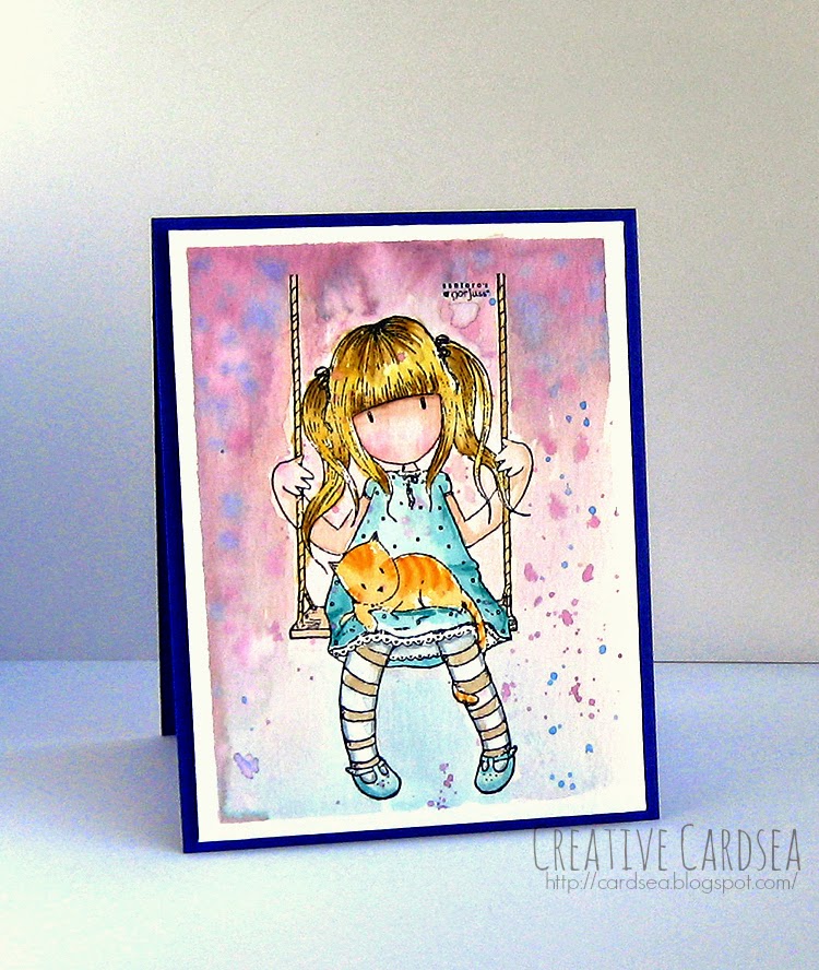
- Gorjuss stamps have a generally simple shape and line guides that help you figure out how the hair is divided into different sections and where the darker shade would go
- Mama Elephant has several stamp sets which have small and cartoon-like characters. Because of their size and style, you won't need a ton of detail and texture - which means you can just focus on figuring out where the shading goes.


If you want a larger area to work with and to practice flicking, try:
- The Greeting Farm has stamps which are very large and with lots of hair. The hair is still relatively simple, but the large stamp size gives you the opportunity to practice flicking and short vs long strokes.

- Another company with simple hairstyles and larger stamps is the Sugarplums line from C.C. Designs.


 If you want a more challenging stamp with more complex hairstyles, try:
- Some Odd Girl - which is my personal favorite, in case you couldn't tell from all the cards I post that use their stamps - has a very large selection of styles. Simple hair, complex hair, fantasy hair and more. Don't be scared of the highly-detailed stamps. They might take a little longer to color, but they're still fantastic practice.

- Tiddly Inks is another company I like. They have recurring characters (like Wryn, Chloe and Ellie), which is fantastic for coloring practice because you'll be working with one hairstyle in many different occasions.


Be bold
Don't be afraid to use bright colors, weird colors or crazy combinations. It's just paper and ink. If you mess up, you just stamp it again and start over. So, get out of your comfort zone and start playing!

Your coloring doesn't have to be perfect. As long as you like it and you're proud of it, it's good enough! There will probably always be someone who's league better than you at coloring. But at the same time, there will be a quiet someone who will look at your work with awe and wish they had your skill.

 So, be brave and play with color. :)

--

And that's it for now! Please leave a comment if you've got any questions or if you want me to talk about anything in more depth.

Next time, I'll go over some more basic Copic coloring - including the basic paper, ink and must-have colors.

Sunday, August 17, 2014

Forest Goddess

The moment I saw Some Odd Girl's Forest Goddess stamp, I knew wanted it. Of course, I didn't have a decent printer at the time, so it had to wait. But the amazing summer digi sale (woo!) made it impossible to resist buying her and a whole bunch of other stamps. So, here I am with gorgeous stamps that all have me excited to create. I've got a-plenty of material for my Saturday Digi series, and a ton of stamps just begging to be colored.

Let me start out by saying that I kind of have mixed feelings about this card. There are parts of it that I love to bits (stamp + some of the coloring, window die idea), but other parts I'm not so sure about. But it's important to share both hits and misses - and who knows, maybe you all will feel inspired, anyway.

I started by printing out the stamp onto some Copic X-Press it blending cardstock. I colored it in with my Copics - which took a few hours, I admit. There were a lot of gorgeous details I wanted to pay attention to, and I enjoyed making the image colorful. I left the skin for last, and encountered my first issue. I decided to try a new color combo that I've seen someone use, but it just did not work for me. It took me ages to blend everything out, and even then there are some really messy bits. I'm not as happy as I normally am with the skin. But it's important to try new things and now I know that this particular color combo will not work for my skin tones.

After this was done, I started to carefully cut out the image. This is where the second difficulty arose. The image is not only complex, but it has a lot of tiny branches and leaves on the head piece. As you can tell, I tried to cut them out initially, but it was slow and difficult. I ended up accidentally cutting out a bunch of the little branches and losing out on the detail. So, I left a little white in the head dress area, and drew in some swirls. I'm not super happy with it, but it's better than having mangled bits of wood.

After the painful cutting out, I got to work on the rest of the card. I wanted to have a decorative window, but I didn't have a die for that. So, I got creative! I grabbed a piece of 4 by 5 1/4" white cardstock and used the Spellbinders Labels 28 die (second largest) to partially cut the window in the middle. This is done by putting the die through the Bigshot only part of the way. I cut the bottom out with my paper trimmer.

For the background, I decided to use a scrap of paper from Bo Bunny's Lemonade Stand 6x6. I cut it to be slightly larger than the window. I created a card base by cutting and scoring a piece of kraft cardstock in half, for a standard A2 card. Using the window as a guide, I positioned the patterned paper and adhered it to the card with my standard dot adhesive.

I used foam tape on the window panel, and adhered it to the card. I then adhered the goddess, using dot adhesive where she touched the panel and foam tape where she touched the patterned paper. So it didn't look like she was floating, I added a bit of gray shadow under her feet.

And this is where my last issue came in. I wanted to add some decorations, but nothing I tried looked right. It was either too overbearing (paper flowers) and obstructing the window border, or it took too much attention away from the central image (enamel dots, sequins). I don't have any leaf dies, so I couldn't add leaves either, and none of my stickers or die-cut packs worked.

So, in the end, I left it as is - maybe a bit too plain, and with mixed feelings.

Supplies:
Some Odd Girl Forest Goddess digital stamp
Neenah Solar White 110#lbs cardstock
Neenah Desert Storm Environmental cardstock 100#lbs
Bo Bunny Lemonade Stand 6x6
Spellbinders Labels 28 dies
Copics: E33, E37, E29, E17, B00, B02, B18, V12, V06, V17, YG23, YG17, R08, R46, R89, BV29, Y11, Y15, YR14, (Skin: E21, E23, E25, E27, R32, R35, 0), W2, E57, E59, E33, B00
3M Scotch Double-sided Foam Tape
Tombow Dot Adhesive (pink)

Saturday, August 16, 2014

Galaxy Halloween

I'm super excited for Lawn Fawn's upcoming release. I think I want everything that they've shown, and at least 2 of each paper packs. But the release is still a couple of weeks away, so I decided to dig through my existing Lawn Fawn stamps and come up with a fun card.

I started by pulling out the Critters in Costume stamp set. I didn't buy this set last year, since it wouldn't have shipped in time for Halloween. But I grabbed it this year, with intentions of making some adorable Halloween treats. Seeing the cute witch cat and the broom inspired me to go for a starry sky scene.

I started by stamping the cat and the broom from Critters in Costume onto some Copic marker paper. I colored them in with my Copics. The set does have coordinating dies, but I didn't want a white border this time, so I fussy-cut the two images by hand.

I used Lawn Fawn's Stitched Journaling Card die to cut a stitched rectangle out of plain white cardstock. I used an embossing pillow to get rid of any static, then used the star stamp from the critters set to stamp a bunch of cute stars around the panel. There was no special placement or anything. I just made sure they didn't overlap and that they stayed inside the stitched rectangle border.

I used Ranger Super Fine Silver embossing powder on the stars, then hit them with my heat tool until the powder melted.

 Then I got to work on the background - and this is where the real fun starts!

I took a long strip of Post it tape and tore it in half - tearing toward me and making sure it wasn't torn completely straight. I put these on the background panel and covered the rest of the panel. This left me with an irregular-looking section. Using my mini foam applicator, layered on some Wild Honey distress ink. When I was happy with the color, I switched to Picked Raspberry and sponged just a little on the left side, and quite a bit on the right side of the panel.

I then unpeeled the tape - which is so much fun! It left me with a fantastic area that had a very defined wiggly edge. I switched to the Salty Ocean ink now, and started sponging the white edges of the panel. I worked from the outside in, being very careful not to put too much heavy color or blending near the orange area -- this would make the colors become all muddy.

I then switched to Chipped Sapphire and Dusty Concord, making the edges deeper and darker. I wanted a sort of two-tone look, so I focused the dark blue on the left, and the purple on the right. I went back to Wild Honey and Picked Raspberry and added just a bit more color around the orange strip to smooth it out. I think it added a pretty neat glow.

Once that was done, I wanted to add more stars. So, I took out my Sakura Souffle pens and added some turquoise, yellow and purple dots. Small tip: you can just hold the pen down lightly pressed to dispense more ink, and it will make for a larger dot. One of the things you have to be careful with the Souffle pens is that they seem pretty dark when first applied, but they dry to be much lighter. I took a minute or so break between each color to make sure I wasn't adding too many dot stars. I let it dry completely.

I created a simple A2 card base from white cardstock and adhered the galaxy panel with foam squares. I then adhered the cat and broom, trying to make it look like the cat was riding it. I messed up a bit with which of its paws should have been forward, but oh well. I still like it. :D

Lastly, I stamped the sentiment from the stamp set under the panel in purple ink.

Supplies:
Lawn Fawn Critters in Costume stamp
Lawn Fawn Stitched Journaling Card die
My Favorite Things Hybrid Ink in Chocolate Brown
Copic Mini Marker Pad 70lbs
Neenah Solar White in 80lbs (panel) and 110 lbs (base)
Distress inks in Wild Honey, Picked Raspberry, Salty Ocean, Chipped Sapphire and Dusty Concord)
Ranger Mini Foam Blending Tools
Sakura Souffle pens (turquoise, yellow, purple)
Copics (E33, E39, Y11, Y15, Y35, C4, BV25, BV29, BV01, BV04, BV08, YG09, G07)
Post-it tape
Stampin' Up Dimensionals
Stampin' Up Rich Razzleberry Inkpad

Bedtime Story

I was in the mood to color something sweet last night, and I decided to color this absolutely adorable Bedtime Story digi from MilkCoffee (on Etsy). It's one of bunches of digis I treated myself to recently, and I really enjoyed coloring it. I'm thinking of making Saturday my digi cards day. I'd love to use all the fun stamps I bought recently. :)

After I printed out the Bedtime Story image, I used my bigshot to cut it into a rounded tag frame. The die I used is from My Favorite things, named Rounded Banner STAX - but it's unfortunately retired. I was able to grab it during the amazing clearance sale they had on their website a few weeks ago.

I colored the image with my Copics, including a bit of a messy backrgound for the stars. It feels like I used up half my markers trying to blend that background, too! The coloring itself took quite a bit longer than usual, as there were a lot of little details I wanted to pay attention to.

But once the coloring was done, I got to work on the rest of the card - which was actually rather simple. I created my card base by cutting and scoring a piece of Simon Says Stamp Lavender cardstock in half for a standard A2 card.

I grabbed a piece of starry paper from Studio Calico's Print Shop 6x6 and cut it to measure 4 by 5 1/4". I adhered a strip of Stampin' Up white ribbon to the right side, and adhered it straight onto the card with my dot adhesive.

I adhered the colored panel with foam squares, positioning it toward the bottom of the card.

Lastly, I added a (slightly wonky) white ribbon and 2 enamel dots to the upper corners.

Supplies:
MilkCoffee Bedtime Story digital stamp
My Favorite Things Rounded Banner STAX (largest die)
Simon Says Stamp Heavyweight 100#lbs cardstock in Lavender
Studio Calico Print Shop! 6x6 patterned paper
Stampin' Up Whisper White organza ribbon
Studio Calico Yellow & Orange enamel essentials
Tombow dot adhesive runner (pink)
Scrapbook Adhesives 3D Foam Squares
Copics: Skin (E00, E11, E13, E15, R20, R22, 0), Girl's Nightgown (R11, RV42, R32, R35), Boy's hat/sleeves (B00, B02, B24, Y35, YR15), Boy PJs (B000, B41, B45), Girl Pillow (R81, V12, C2, C4), Boy Pillow (C2, C4, G24), Book (E42, 0, E53, E44), Boy Hair (Y11, Y35, E35, E37), Girl Hair (E33, E39, E29), Stars (Y11, Y35), Background (BV01, BV11, BV13, 0)

Friday, August 15, 2014

Layered Thanks

I really admire Shari Caroll's card-making style. It's clean, colorful, and makes fantastic use of layering. I also love that she makes use of patterned paper and die-cuts, which always gets me thinking about how I can make use of all the decorative bits that are collecting in my craft closet.

With this card, I wanted to try out a similar layered look.

I started by stamping the circular woodgrain stamp from WPlus9's Woodgrain Silhouettes stamp in Stampin' Up's Bermuda Bay ink. I really liked the look of woodgrain paired with a teal color - I think it gives an unusual look. After stamping, I carefully cut around the image, leaving a small white border.

For the patterned paper, I decided to use My Mind's Eye Mint Julep 6x6. Even though the colors did not match Bermuda Bay ink exactly, I thought the general tones complemented the color very well. I cut a strip of the striped paper with one of the dies from MFT's Blueprints 13.

While I had my Bigshot out, I also cut out a decorative tag from Simon Says Stamps Medium Tags dies, as well as a small "thanks" from Simon Says Stamp's Thanks die. Since the thanks die is so small and intricate, I used a metal adapter to cut it out just perfectly.

I created the card base by cutting and scoring a piece of white cardstock for a top-folding A2 card (measuring 4 1/4 by 5 1/2"). I also cut a smaller panel out of the same white cardstock, measuring 3 3/4 by 5". I decided to use this smaller panel as the center panel of the card, rather than making it a single-layer.

It was time to layer all the elements together. I adhered the patterned paper piece straight onto the white panel with my standard dot adhesive. I then adhered the tag using foam squares. I noticed that it was blending a bit too much into the background, so I used a white gel pen to add a dotted line just inside the tag edges.

For the woodgrain piece, I used a combination of dot adhesive (where it covered the tag) and foam squares (where it touched the patterned paper). I used Tombow mono-multi liquid glue in a few spots on the thanks die-cut, and adhered it straight onto the tag and woodgrain piece. I left the ends without adhesive, as they're raised from the card.

Lastly, I scattered a few coral pink enamel dots around the design. And there you have it! It was fun to immerse in someone else's style for a card, and I hope I did it justice.

Supplies:
WPlus9 Woodgrain Silhouettes stamp
Stampin' Up Bermuda Bay ink
Neenah Solar White cardstock in 110#lbs (card base) and 80 #lbs (panel)
My Mind's Eye Jubilee collection Mint Julep 6x6
My Favorite Things Blueprints 13
Simon Says Stamp Medium Tags dies
Simon Says Stamp Thanks die
My Favorite Things Large Metal Adapter
Tombow Dot Adhesive (pink)
Tombow Mono-Multi Liquid glue
Stampin' Up Dimensionals
Freckled Fawn Pinks Enamel Dots

Wednesday, August 13, 2014

Avery Elle - Kraft Boat

Second post for today, but I just couldn't wait to post this card!

I noticed that Avery Elle had another challenge up, and this time it's to use Kraft. I love kraft paper, and I go through quite a bit of it, so I decided to make a card for this challenge.

Since kraft was the challenge, I started by creating my card base from Neenah's Desert Storm Environmental cardstock (100 lbs) by cutting and scoring a sheet to create a standard top-folding A2 card. I've still got summer on my brain, so I went with a nautical theme.

I stamped the boat from Avery Elle's Knotty stamp set in brown ink onto some Copic marker paper. I colored it in with my Copics, keeping it very simple and light. After the boat was colored in, I carefully cut it out with my scissors, leaving a small white border.

I cut a panel out of white cardstock and stamped the 3 nautical lines from the stamp set onto it, using pale blue ink (this part is a bit hard to see in the picture, but it's a subtle effect that ties the card together). I then grabbed the gorgeous Avery Elle Sorbet paper pack as well as the Brights paper pack. I used my Bigshot to cut out some waves from sea glass, striped mint and aquamarine hearts.

I adhered the waves at the bottom of the white panel with my standard adhesive, then adhered the boat using thin foam squares. I adhered the whole panel straight onto the card base.

I wanted a bit of a tone-on-tone look, so I used kraft ink to stamp the nautical stripes at the top of the card base. I also stamped the cute sentiment from the Knotty set in brown ink.

There was still some room left at the bottom of the card, so  I stamped the stripes again on a separate piece of cardstock, and tied a string of gold cord around it. I adhered it to the card with foam squares. And the card was done!

Supplies:
Avery Elle Knotty Stamp set
MFT Hybrid Ink in chocolate brown, sno-cone and kraft
Ranger Archival ink in Coffee
Neenah Desert Storm environmental cardstock 100#lbs
Neenah Solar White 80#lbs
Avery Elle Sorbet paper pack 6x6
Avery Elle Brights paper pack 6x6
Copics (E33, E35, E37, E50, E27, R08, BG72, BG18, BG75)
Mama Elephant Landscape Trio dies
Pretty Pink Posh Stitched Borders I dies
May Arts gold metallic string
Scrapbook Adhesives thin 3D foam squares